ROOM-BY-ROOM MATERIAL GUIDE
The Brass-and-Linen Blueprint: How to Style Fabric Wall Lights Room by Room
A brass wall light with a fabric shade sounds easy enough to style. Brass is warm, linen is soft and both work with almost everything—or so it seems. Then you hold the fixture beside a yellow-toned oak cabinet, cream curtains and a beige sofa, and suddenly the whole room looks as though it has been steeped in tea.
The answer is not to match more carefully. It is to give each material a different role. Let the metal add warmth, allow the shade to soften the wall and use timber, stone or a cooler colour to keep the palette from drifting into one large beige blur.
A useful rule of thumb: coordinate the lamp with the room’s fixed materials, but do not try to match all of them. Rooms feel more natural when the materials are related without being identical.
Look at the Room Before You Look at the Finish
A small brass swatch can be charming under showroom lighting and completely wrong beside your flooring at home. Before comparing finishes, stand back and look at the whole wall. Which two surfaces take up the most space? In a bedroom, that might be the wall colour and headboard. In a hallway, it could be painted plaster and a timber console.
Those large surfaces matter far more than a picture hook or cabinet handle. Let them set the direction.
It also helps to decide what the wall light is there to do. Is it framing a bed, brightening an awkward hallway, making a reading chair feel intentional or anchoring a piece of art? Once the fixture has a clear job, choosing its material and position becomes much less mysterious.
Make a Five-Part Material Board
You do not need professional samples or a beautifully photographed mood board. A few scraps, paint cards and phone photos will do the job. Gather these five things:
- Wall
Paint, wallpaper, tile or panelling. - Wood
The largest timber surface nearby. - Textile
Curtains, upholstery, bedding or a rug. - Second metal
Black, chrome, nickel or bronze. - Light
The fixture finish and shade texture.
Prop the samples vertically against the wall where the light will go. This slightly unglamorous step is much more useful than arranging everything flat on a table. Light hits a wall differently from a tabletop, and the relationship between the shade, paint and metal is what you will actually see every day.
If you cannot borrow a shade sample, pull up a clear product image on a tablet and place it beside the materials. It is not perfect, but it is still better than judging the lamp against a white product-page background.
Let Linen Repeat a Feeling, Not an Exact Colour
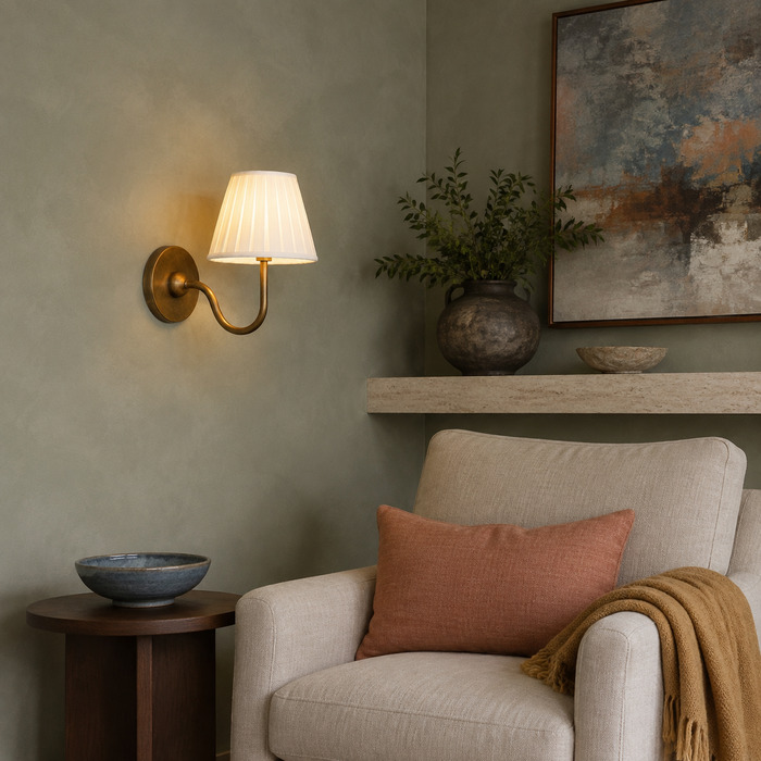
A fabric shade does not need to be the same colour as the curtains. In fact, an exact match can make the room feel as though everything arrived in one coordinated furniture delivery.
A looser connection usually looks better. The shade might repeat the natural weave of the curtains, the warm off-white of a rug or the slightly slubby texture of an upholstered chair. Pick one quality and leave a little difference elsewhere.
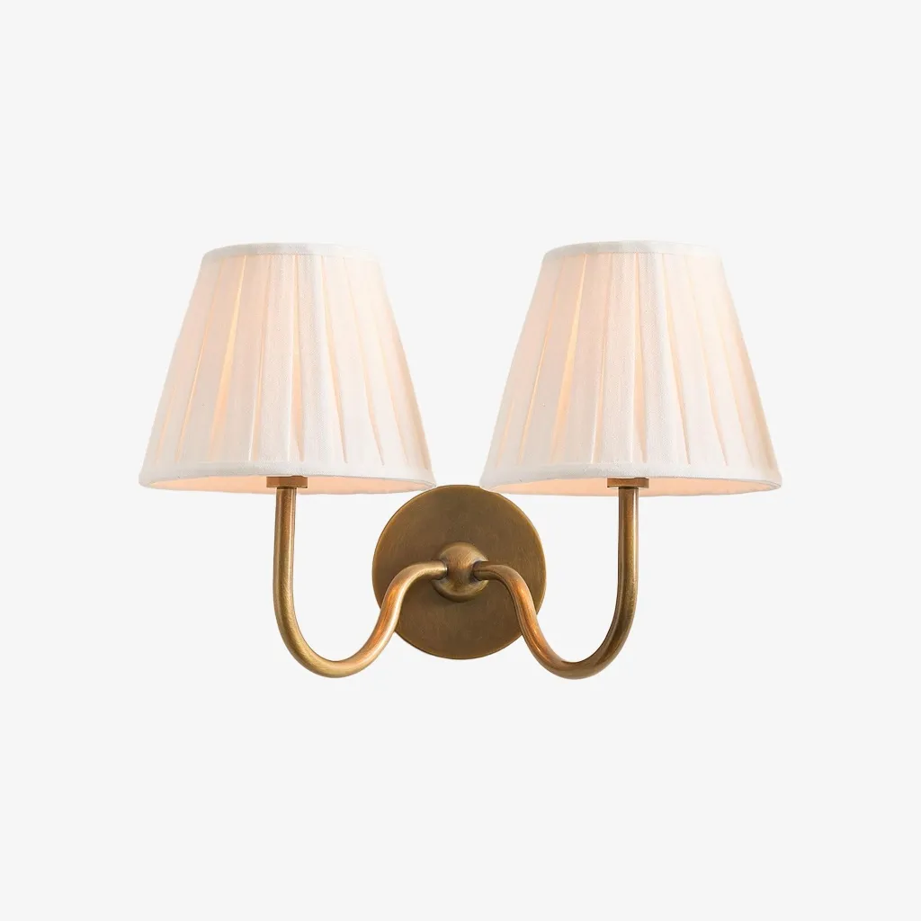
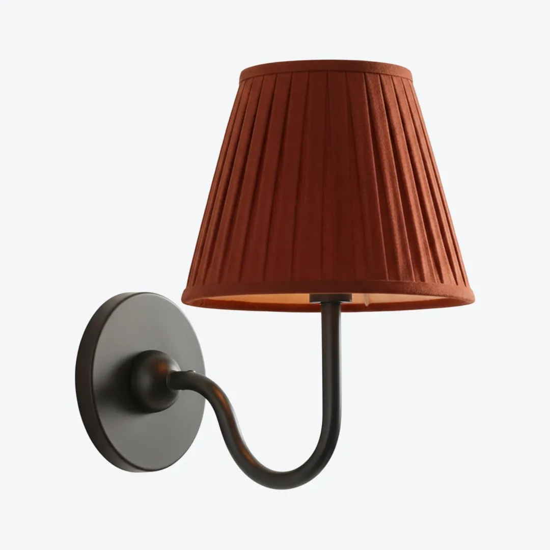
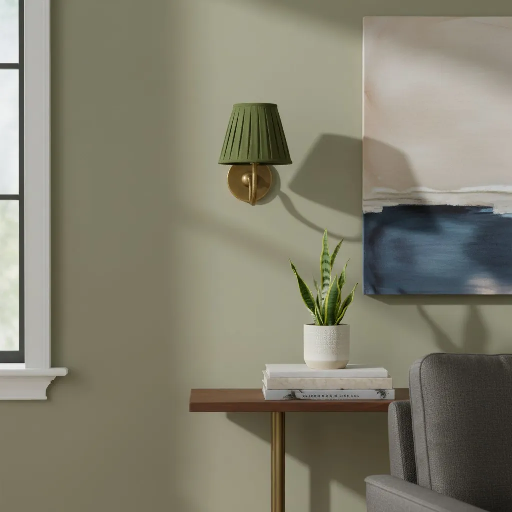
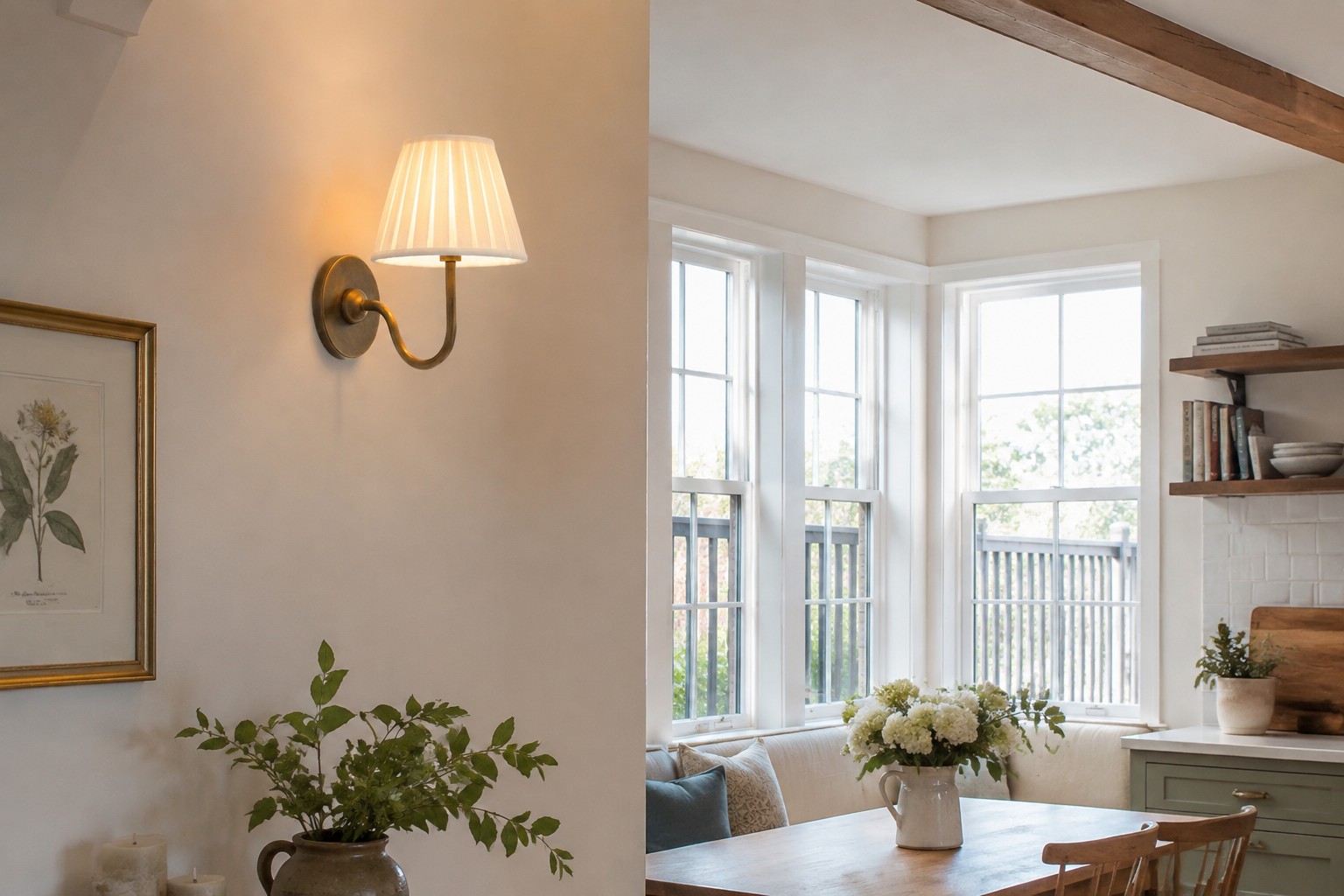
For example, a white pleated shade looks lovely beside oatmeal upholstery because the colours are related but not identical. A beige shade can sit comfortably against a clean white wall for the same reason. If every textile lands in the same middle-beige range, add something with more backbone: dark walnut, charcoal, muted green, grey stone or a cooler metal detail.
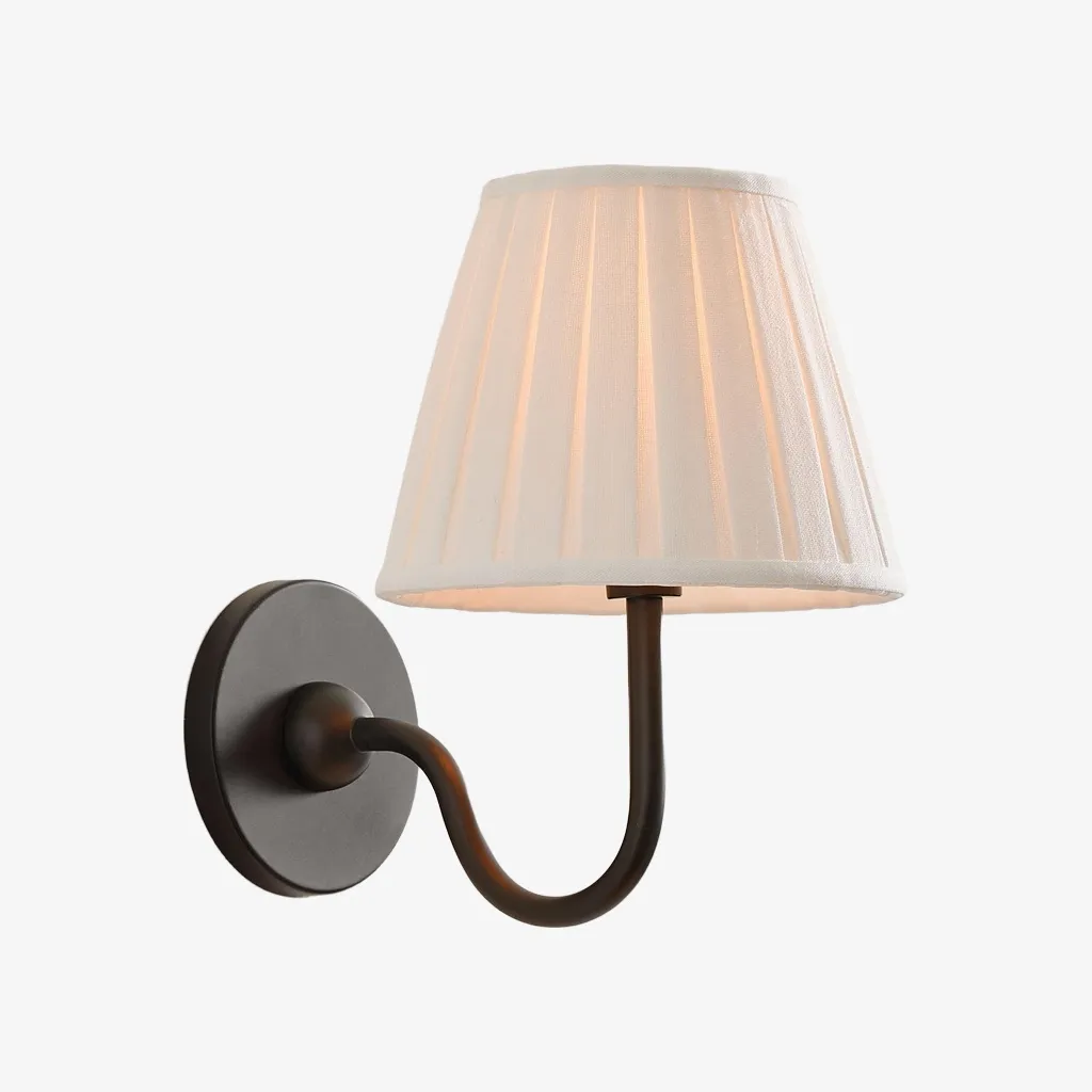
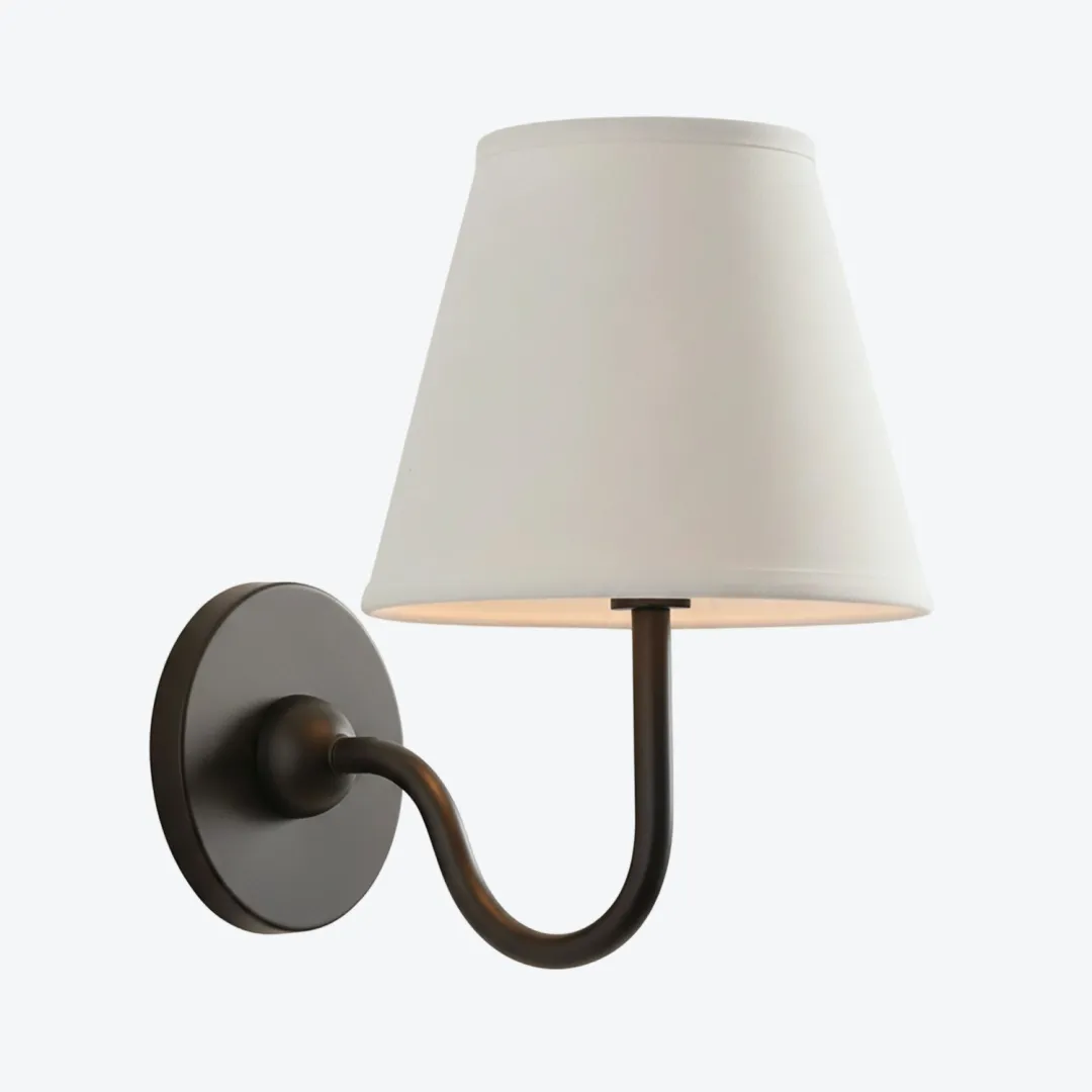
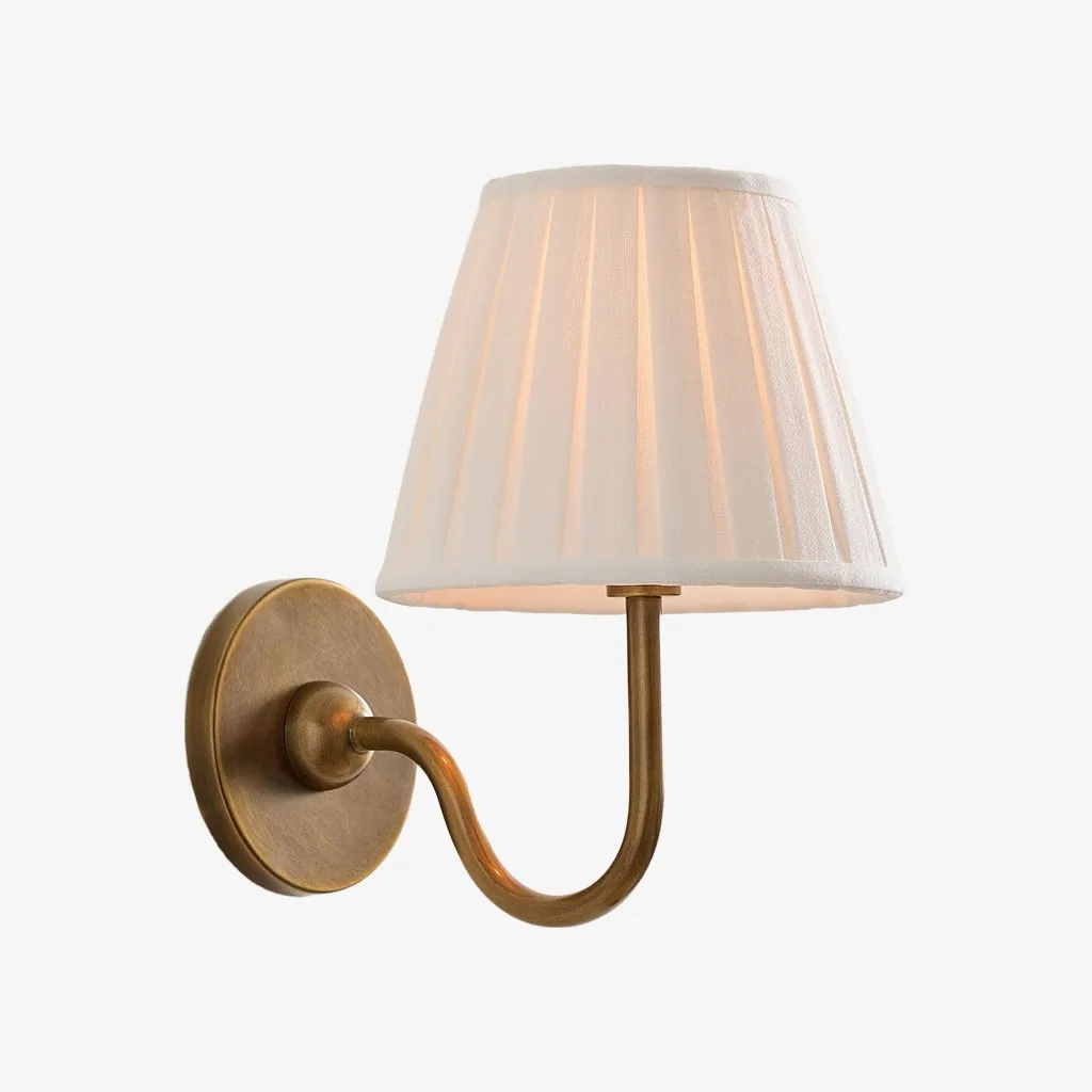
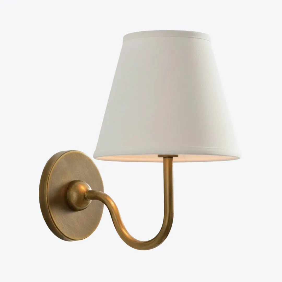
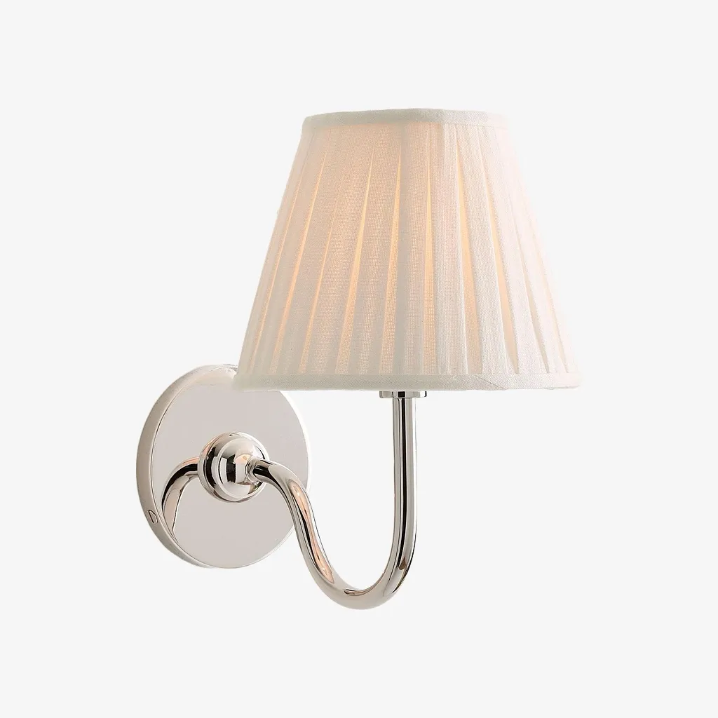
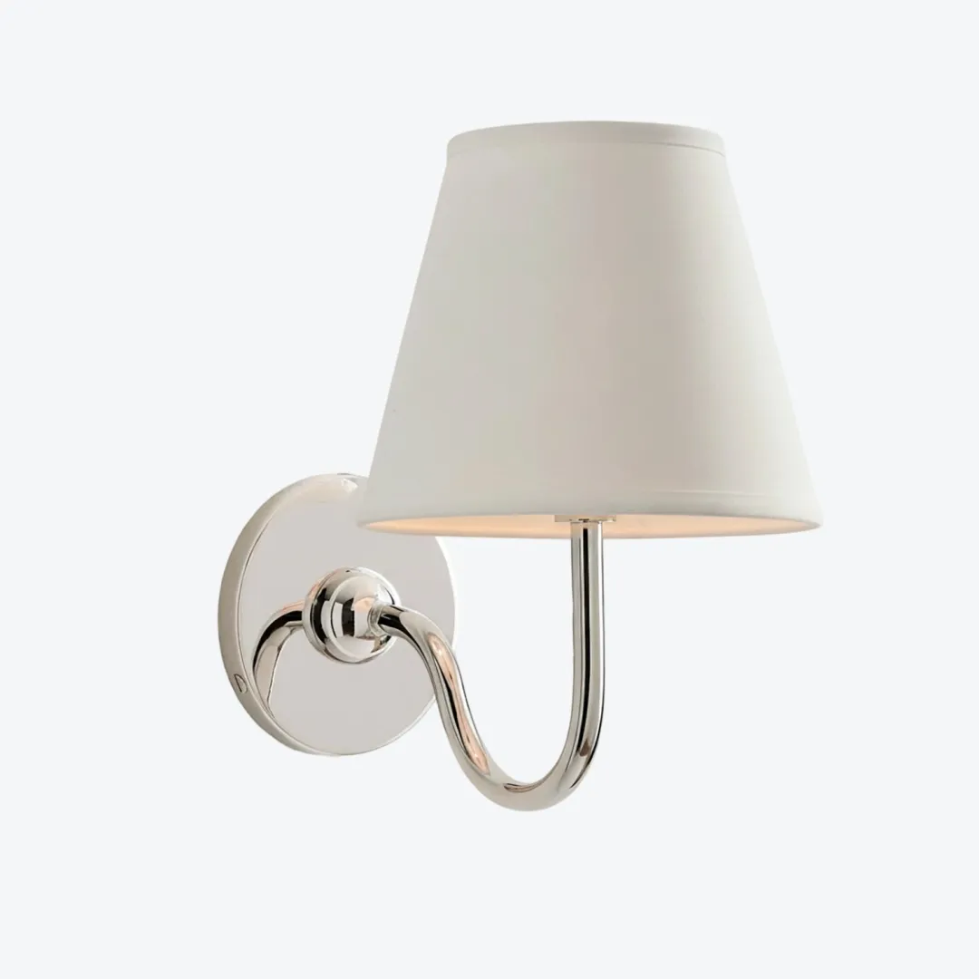
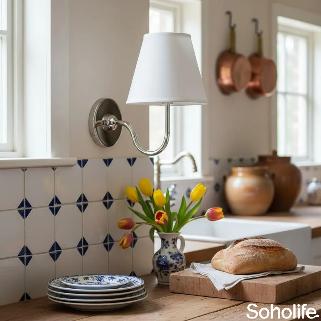
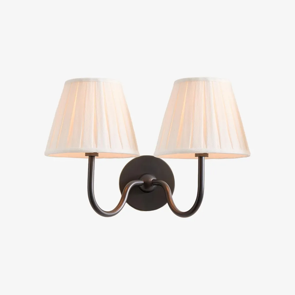
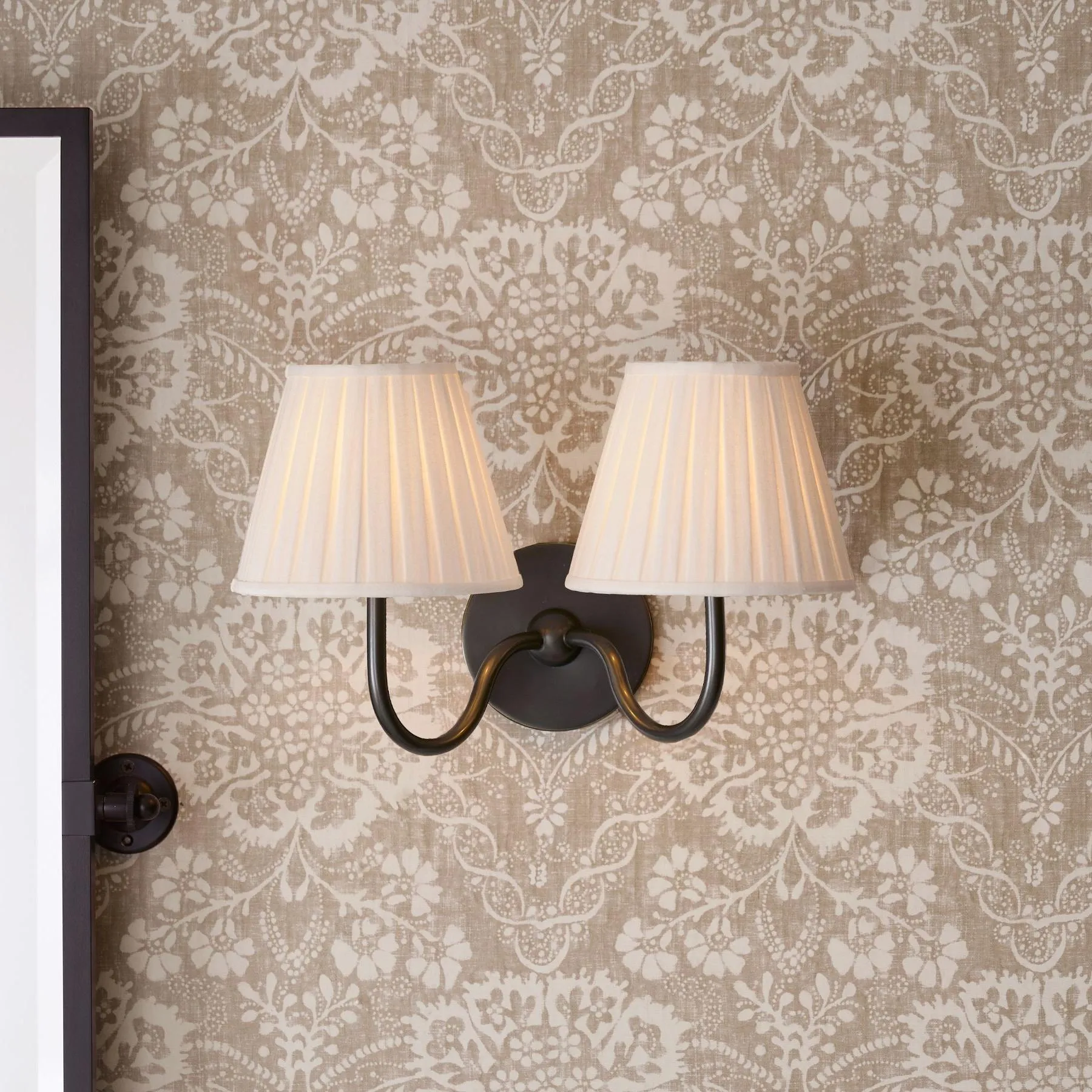
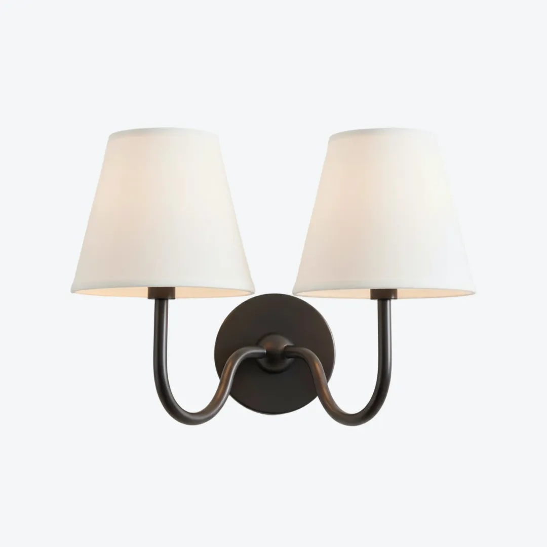
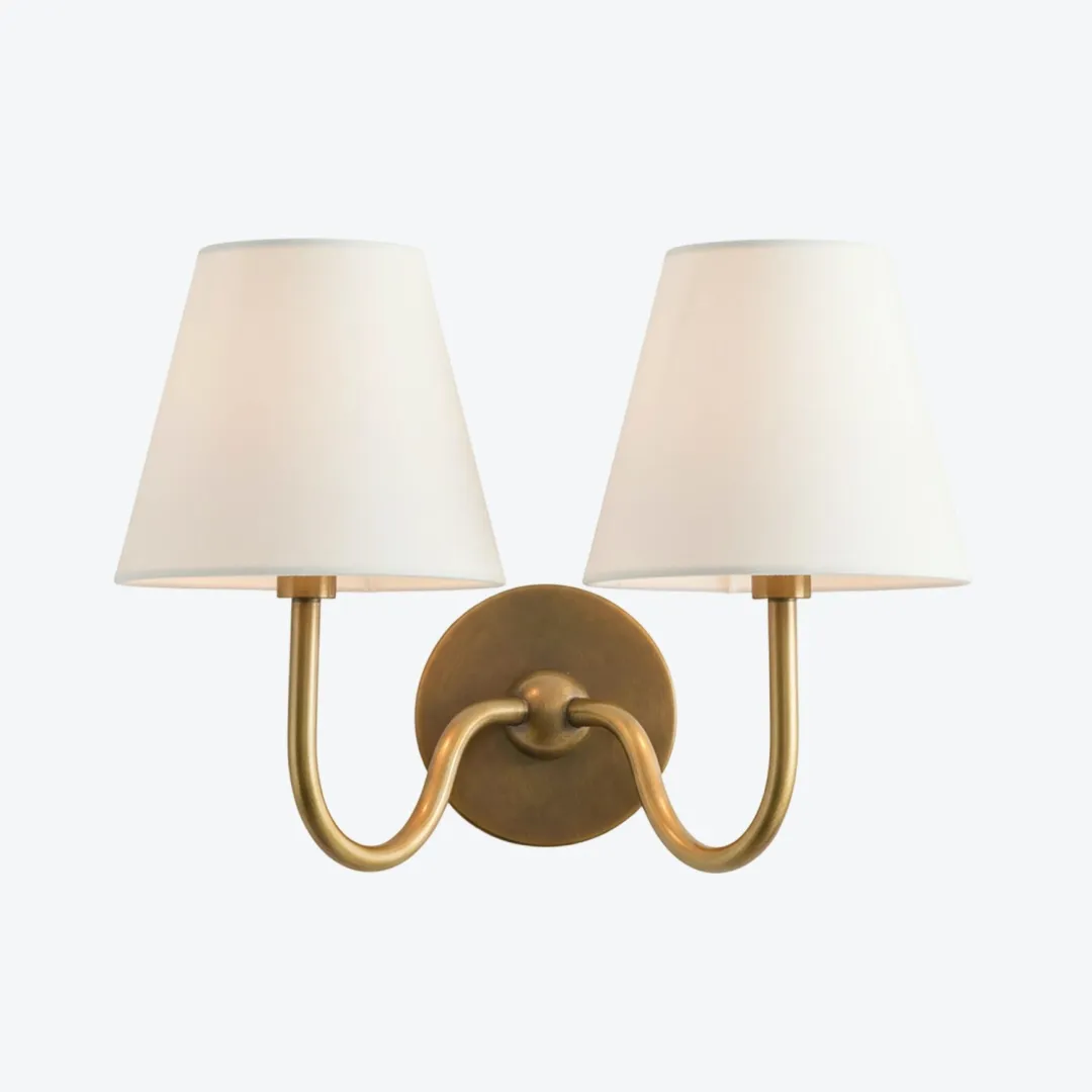
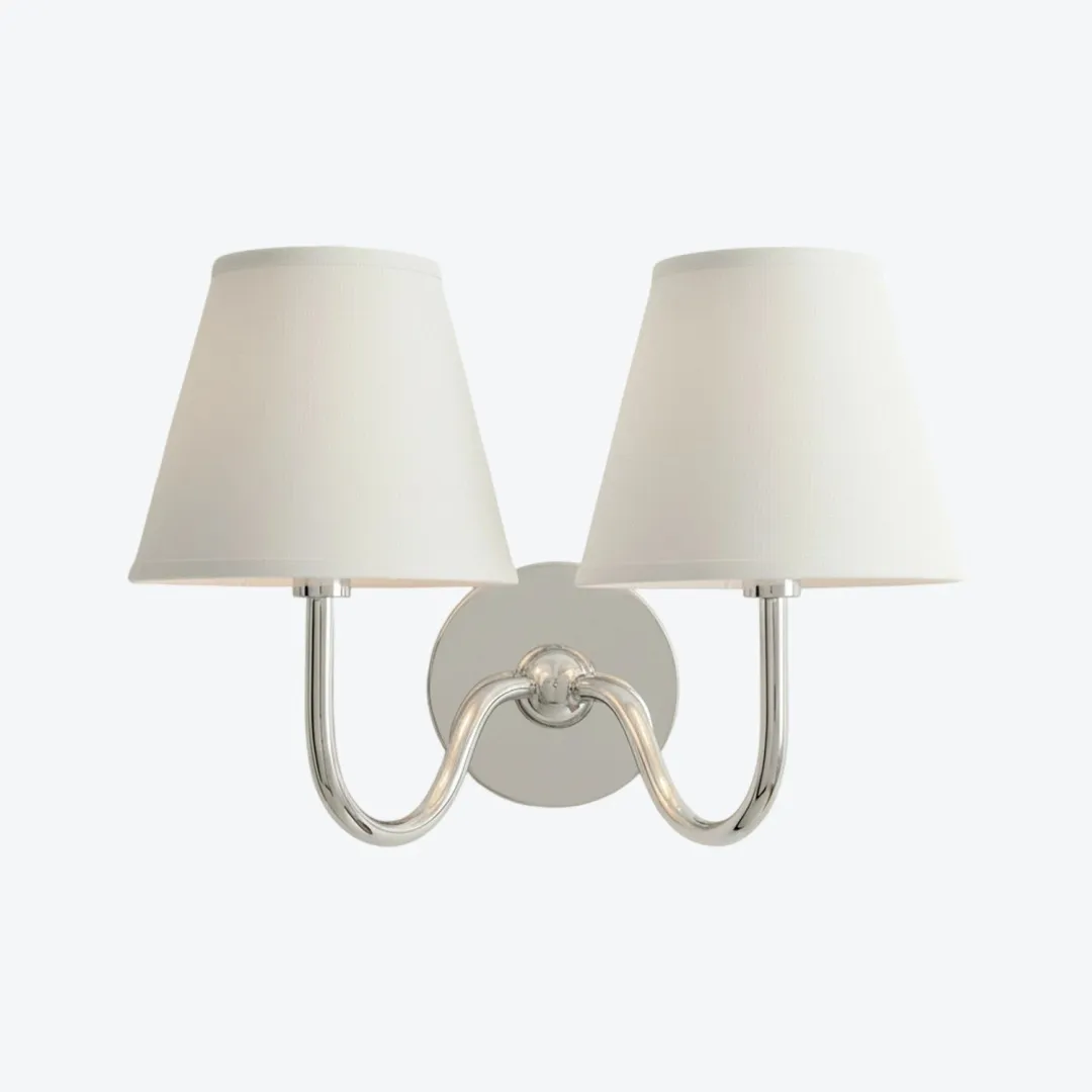
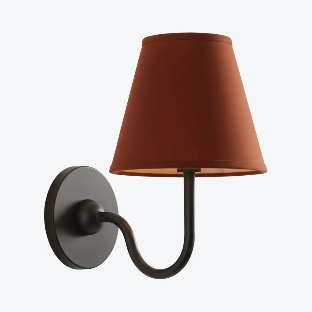
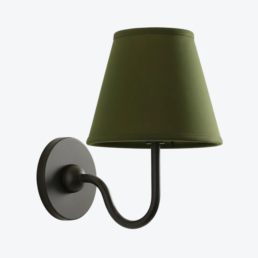
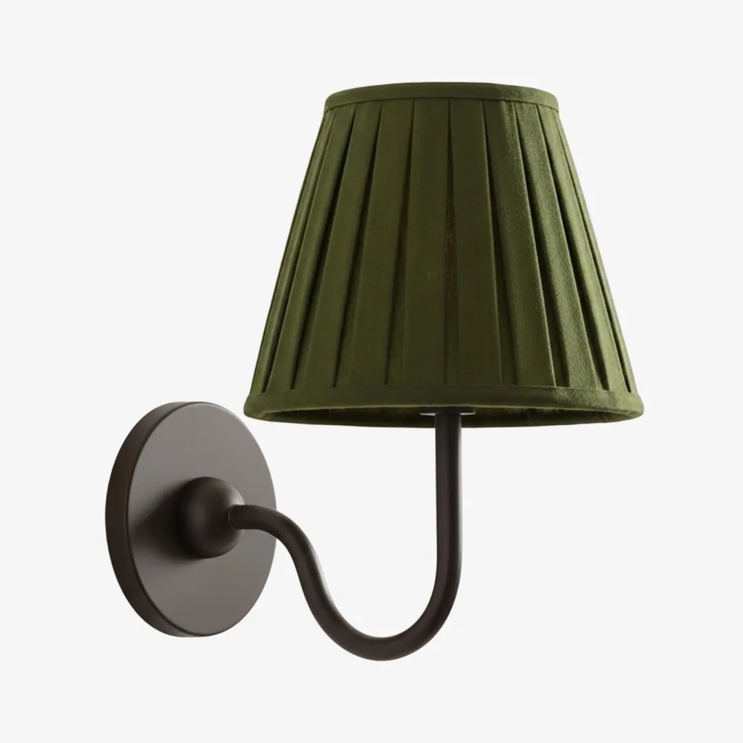
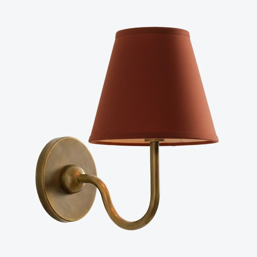
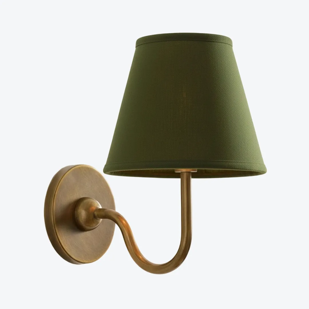
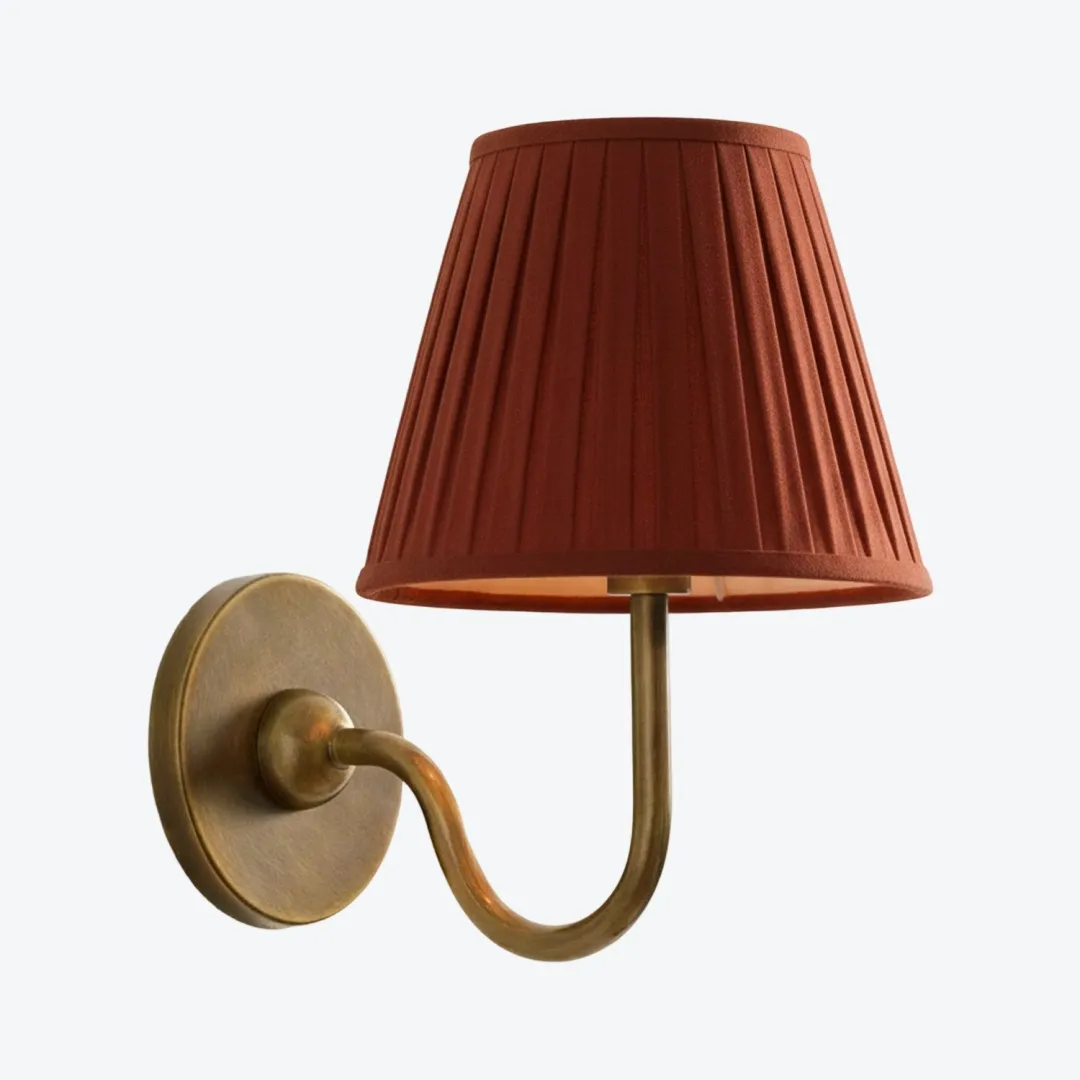
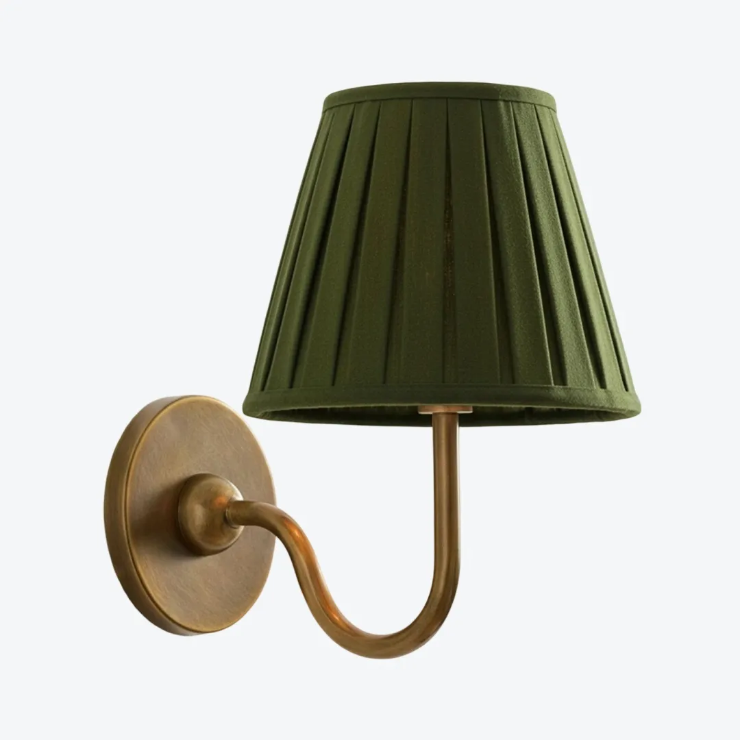
The Luvora wall light is available with different shade colours and textures. Compare the shade with the largest textile in the room rather than choosing by the variant name alone.
If your main concern is whether an existing brass fixture feels dated, read Brass Without the Time Warp: How to Make Wall Lights Look Modern before rebuilding the rest of the palette around it.
Bedroom: Calm Is Good, Flat Is Not
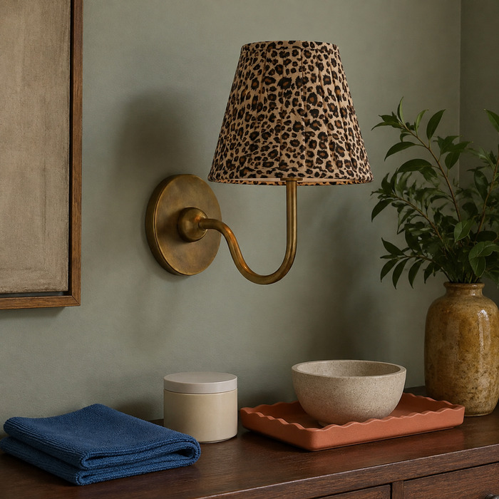
Try: a softly shaded wall light, one main timber tone and a single repeat of the brass finish.
Skip: cream walls, a beige headboard, beige bedding and brass at every height. Even restful rooms need an edge somewhere.
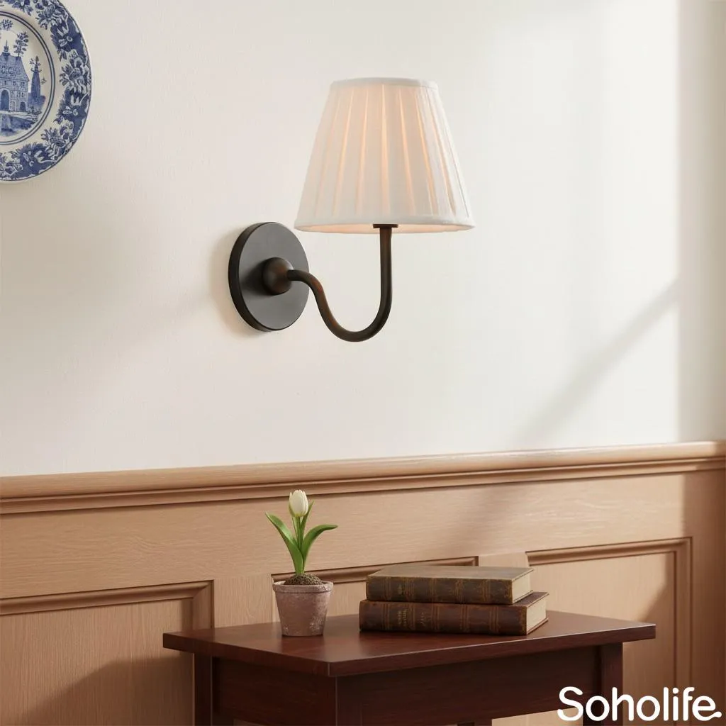
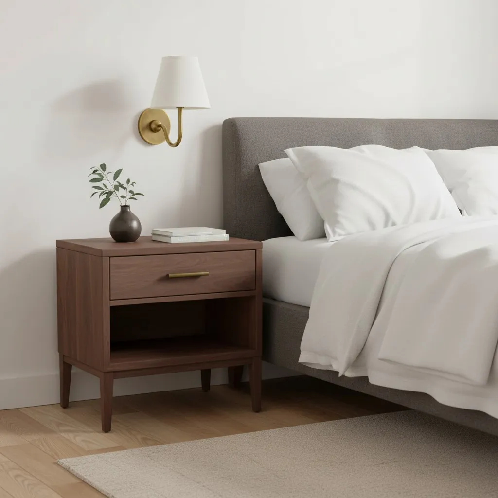
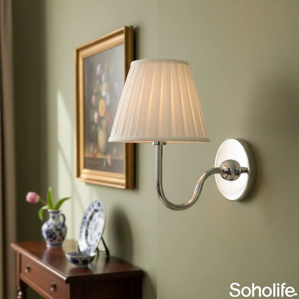
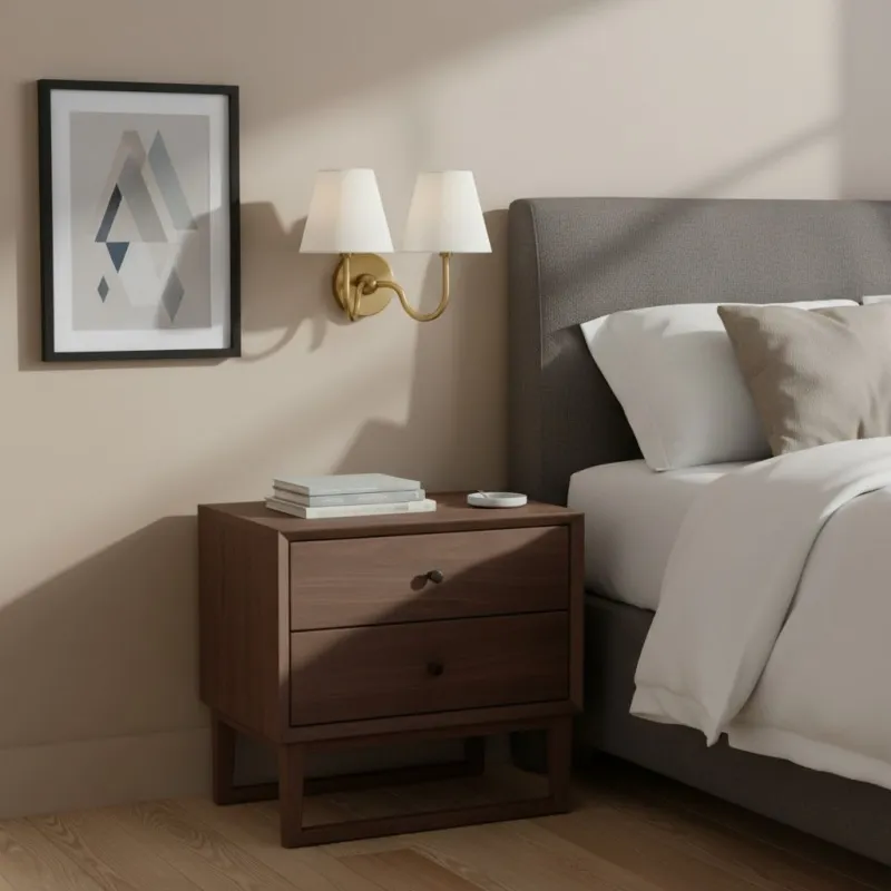
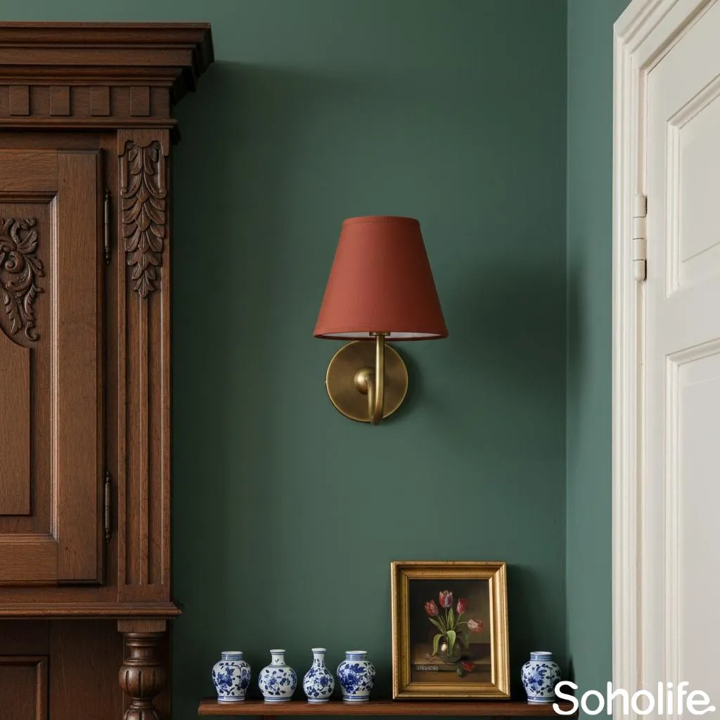
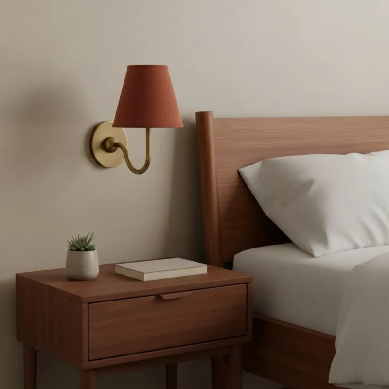
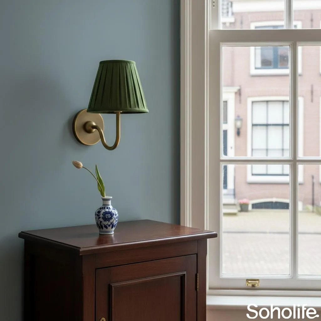
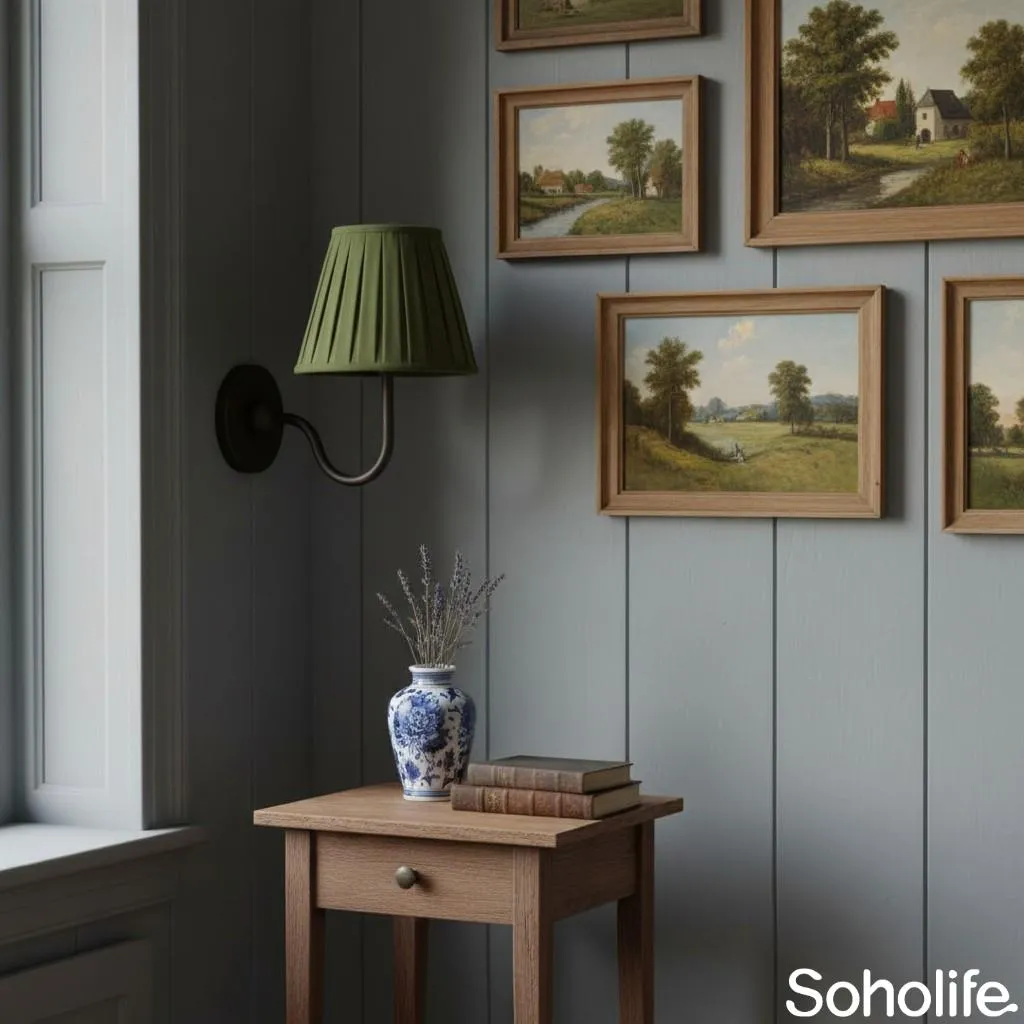
Bedrooms often contain several pale fabrics, so it is easy for a fabric-shaded lamp to disappear. The fix does not have to be dramatic. A dark bedside table, green-grey wall or narrow black picture frame may provide all the contrast the room needs.
Repeat the brass once if you like—perhaps in a small frame or drawer pull—and then call it done. The shade can relate to the bedding through its weave rather than its exact colour. That tiny variation is what keeps the room looking collected instead of packaged.
Living Room: Give the Light Something to Belong To
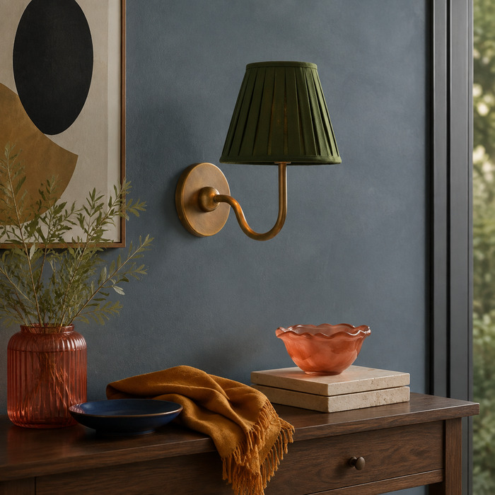
Try: positioning the light beside a sofa, above a console, within a bookcase bay or next to a piece of art.
Skip: scattering little brass objects across every shelf in an attempt to make the lamp “tie in.”
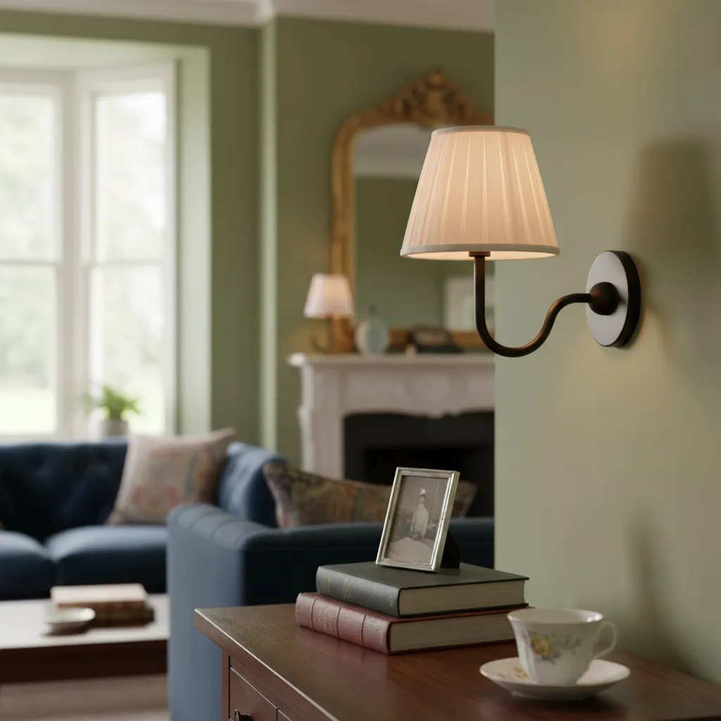
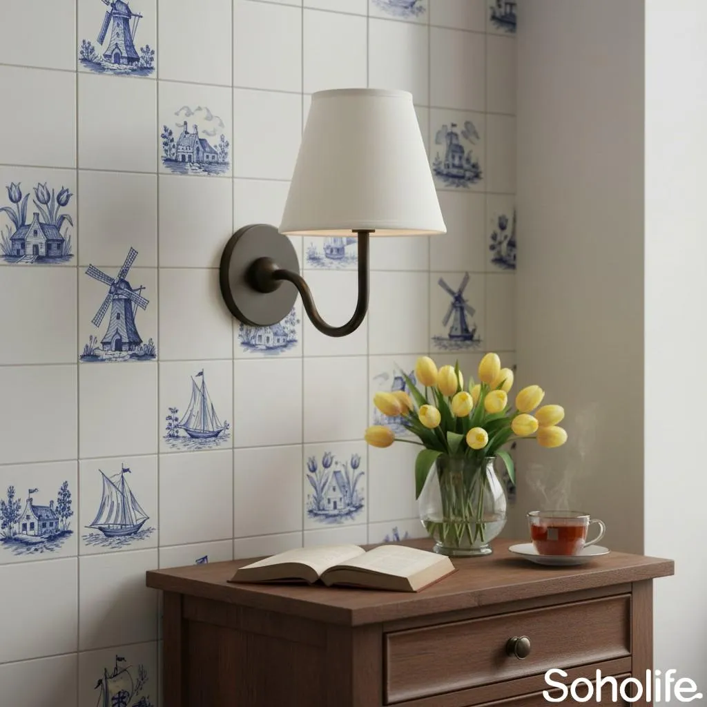
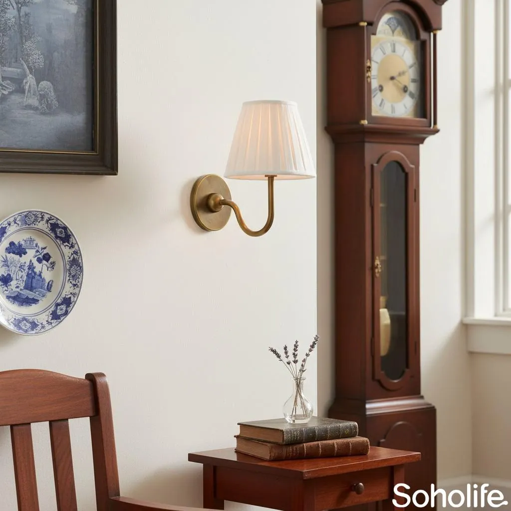
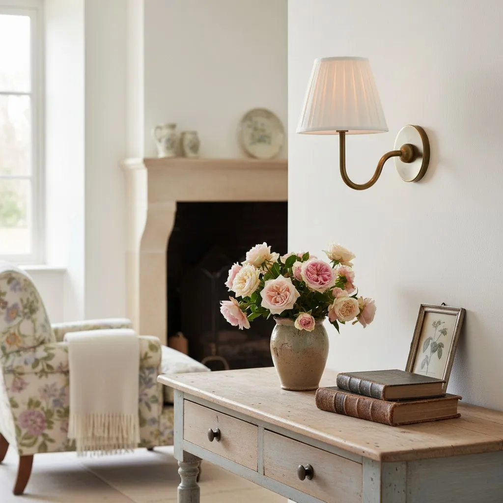
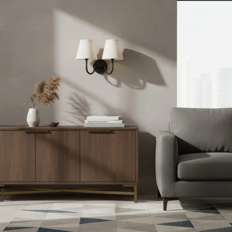
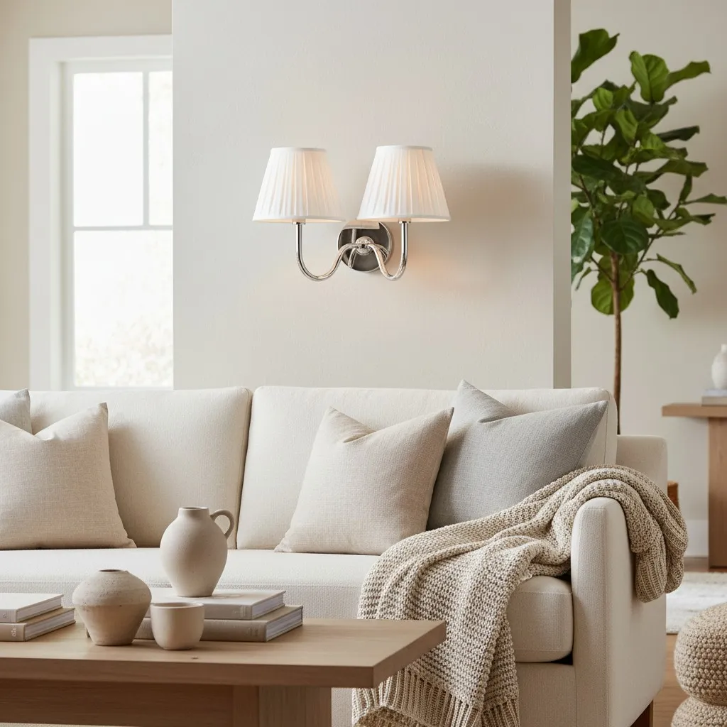
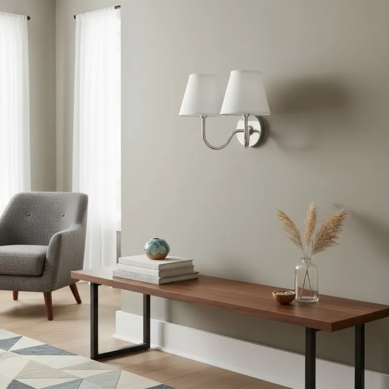
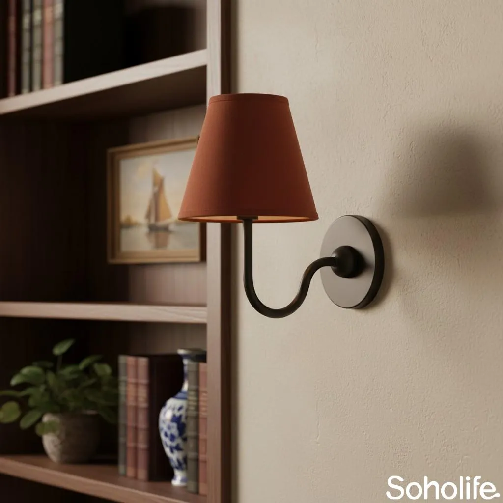
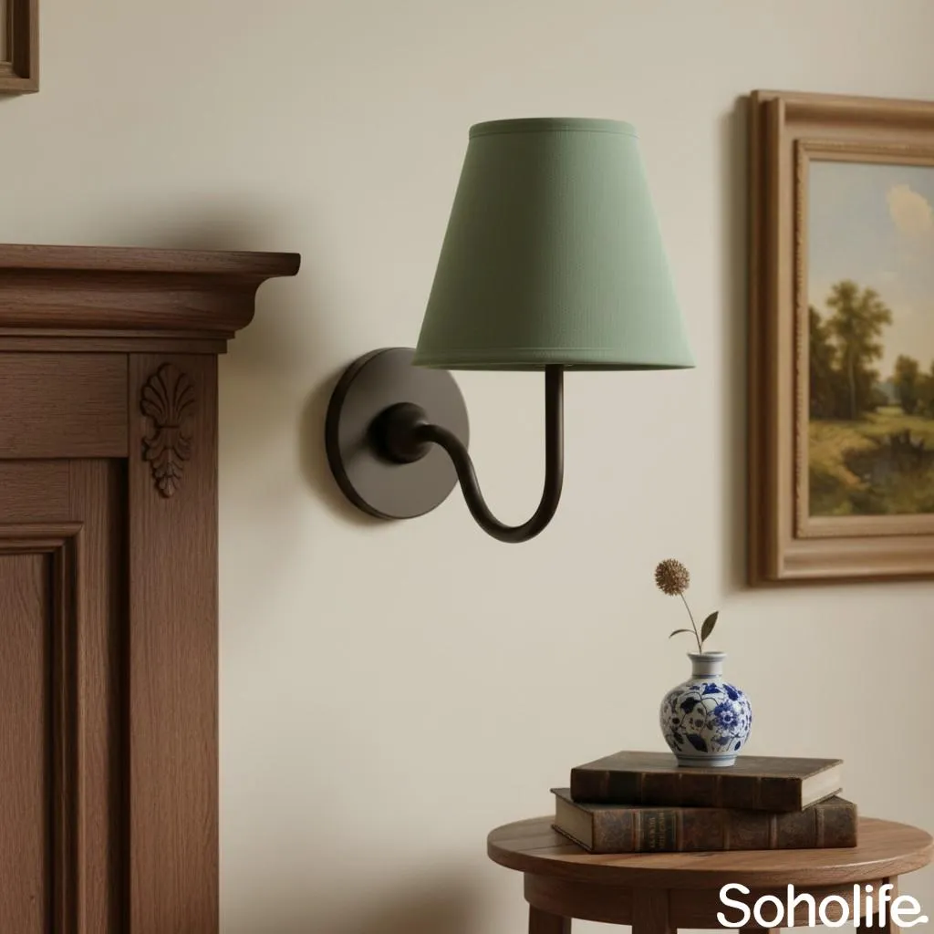
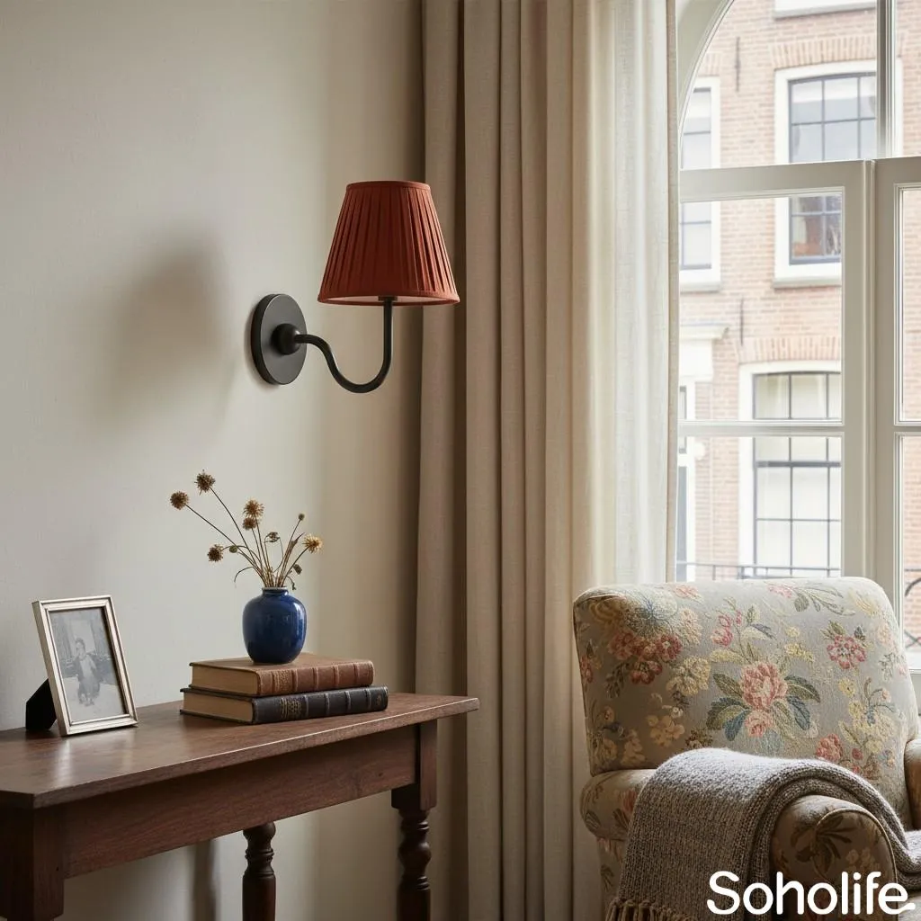
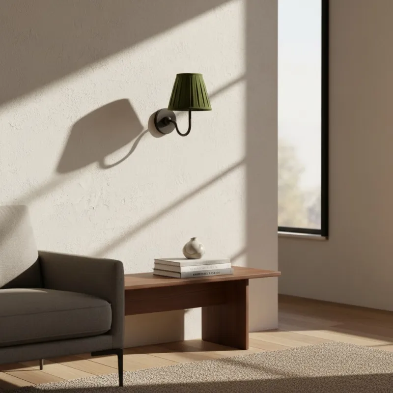
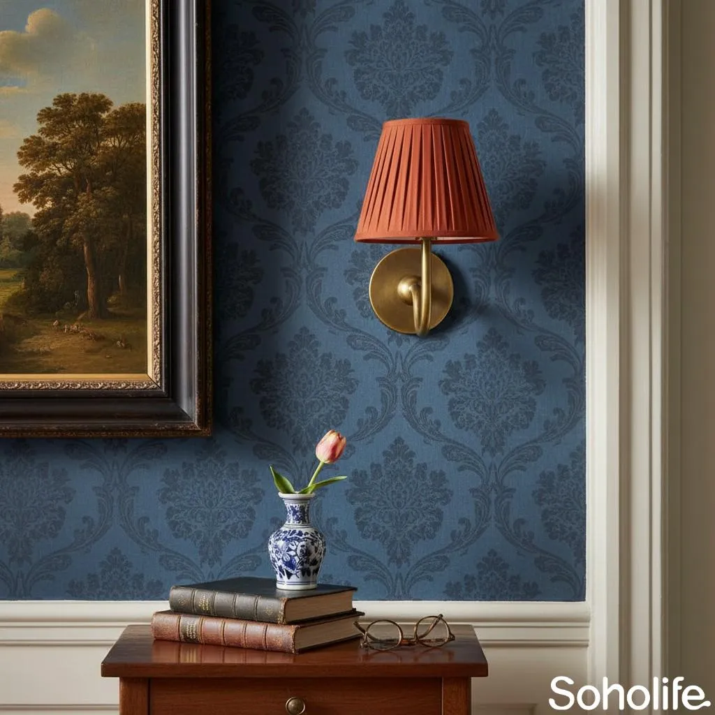
A wall light looks far more convincing when it is attached visually to one part of the room. Beside a dark timber bookcase, tumbled brass introduces a lighter warm note. Against pale stone, the linen shade softens the transition while a black frame or table leg keeps the arrangement crisp.
There is no need to distribute matching metal around the entire living room. One lamp can be enough when it clearly belongs to a reading chair, console or artwork group. The eye understands that relationship without needing six brass accessories to explain it.
Hallway: Think About the View from Ten Feet Away
Try: a clear silhouette against the wall and one related material farther along the hallway.
Skip: a shade, wall and trim colour that all merge into the same pale value.
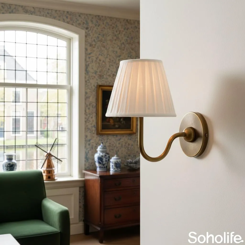
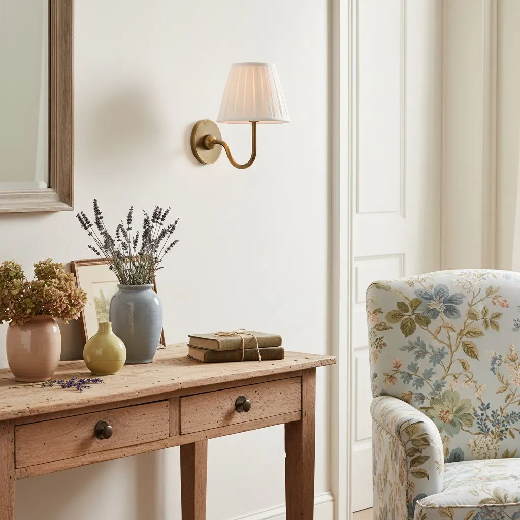
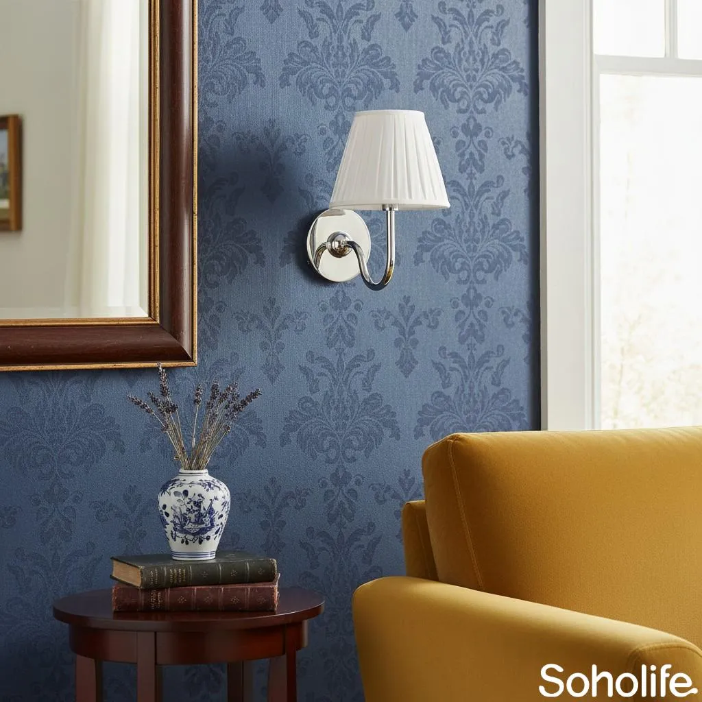
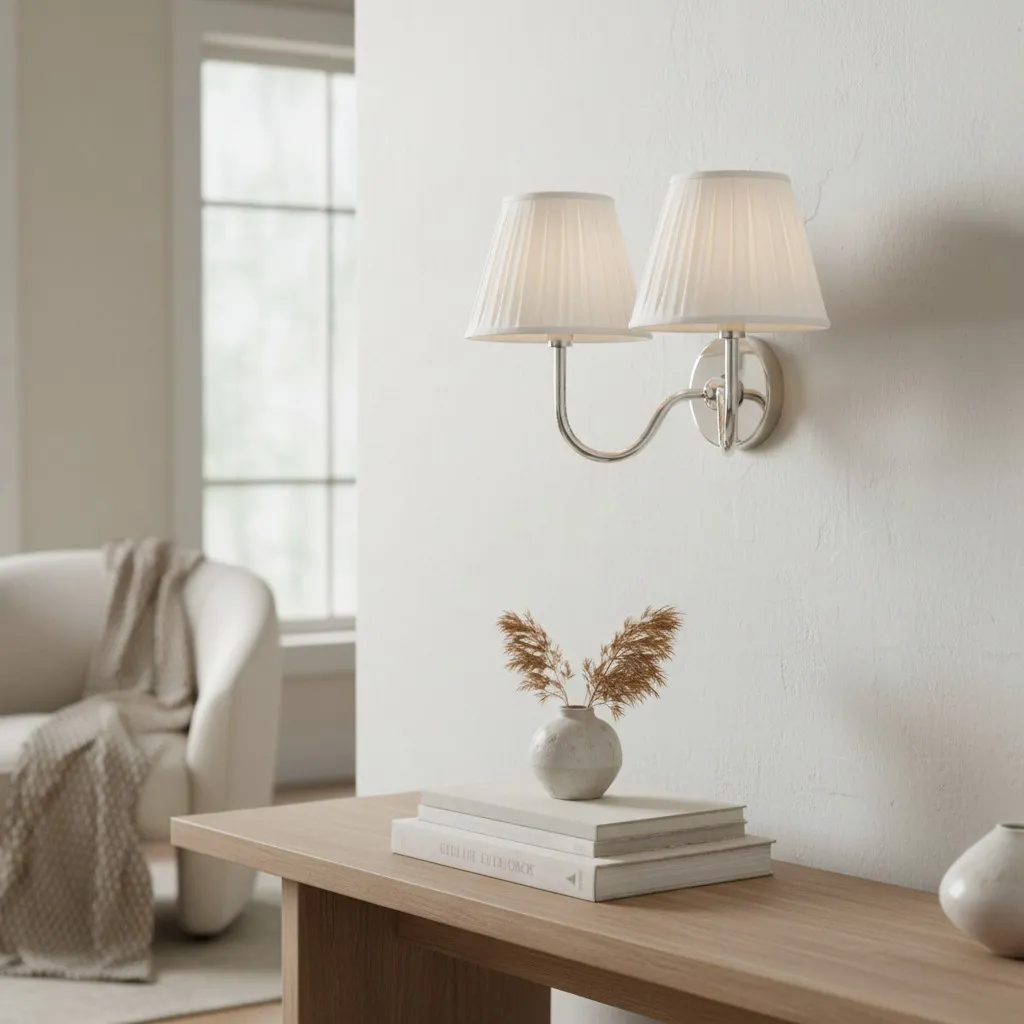
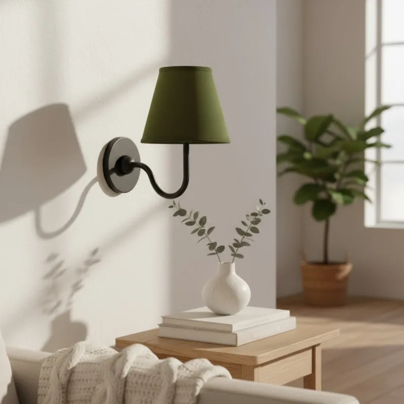
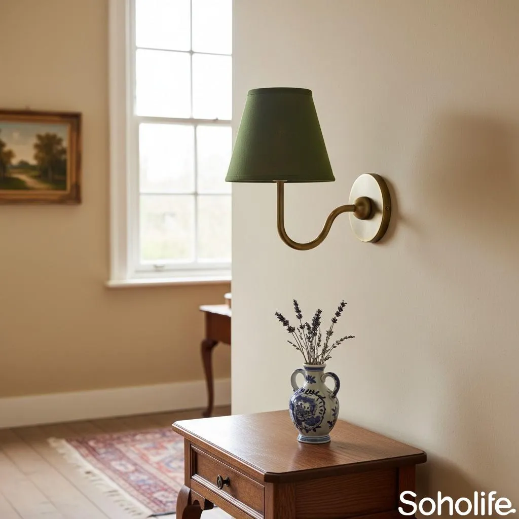
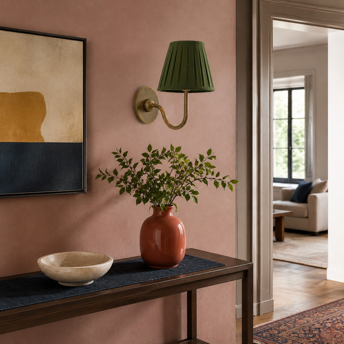
Most hallways are seen from a distance before anyone walks past the fixture. Step back to the doorway and make sure the light still has a readable outline. A white shade on a white wall can work beautifully if the brass arm is visible and a darker runner, frame or door gives the passage some depth.
On a coloured wall, you can afford to keep the linen shade quieter. The texture will become more noticeable as you approach without making the whole corridor feel busy.
Do not forget the less exciting measurement: projection. The listed Luvora single-head configuration is approximately 18 cm wide, 25 cm deep and 25 cm high. In a narrow route, that 25 cm depth matters more than how compact the fixture looks from the front. A lovely lamp is considerably less lovely when everyone has to lean around it.
Dining and Console Areas: Let the Shade Soften the Scene
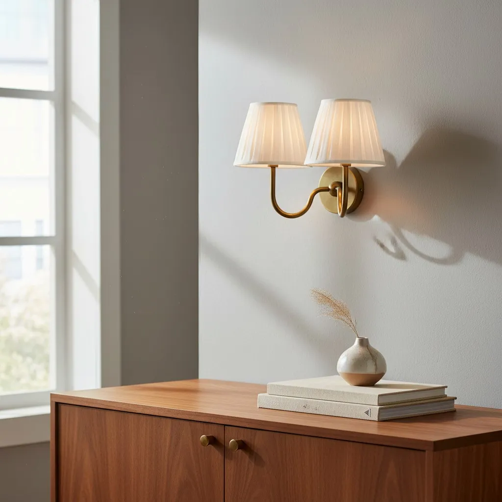
Try: using brass as a small bridge between timber furniture, tableware and framed art.
Skip: asking the wall light to compete with a shiny mirror, chandelier and metallic table setting at the same time.
Dining and console areas often look busiest in the evening, just when the lamp is switched on. Decide which reflective object deserves the most attention. If a large mirror or chandelier is already the star, let the wall light add a quieter layer of fabric and warm metal at the edge.
Next to warm timber, a little glass, chrome or grey stone can stop the arrangement from becoming visually heavy. You are not trying to make the palette cold—just giving all that warmth something to lean against.
Choose the Finish from the Materials You Cannot Change
Paint can be changed over a weekend. Flooring, stonework and large pieces of furniture are rather less cooperative. Choose the lamp finish with those fixed elements in mind.
- Tumbled brass
A good choice when the room needs warmth without a highly polished shine. - Antique bronze
Comfortable beside darker timber, deeper colours and traditional materials. - Chrome
A cleaner partner for cool hardware, grey stone and black-and-white rooms.
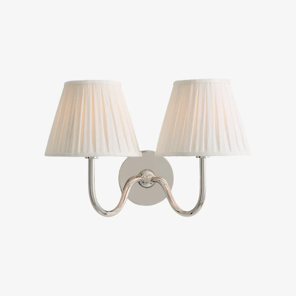
The Luvora has an iron body with decorative finish options and a linen shade; it is not made from solid brass. The double-head version is approximately 40 cm wide, 23 cm deep and 25 cm high, so it reads as a broader central feature. Give it enough wall space and a piece of furniture or artwork with sufficient visual weight below it.
Once you have assembled the five materials, compare the current Luvora finish and shade combinations with the actual wall, timber and textile rather than judging them separately.
Check Everything Twice: Once by Day and Once at Night
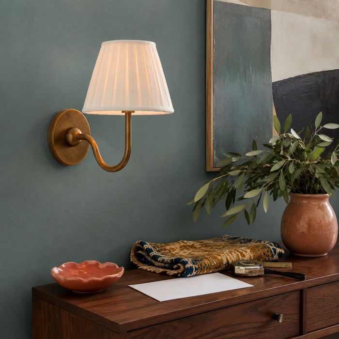
A palette that looks beautifully balanced at lunchtime can change character after sunset. White linen may appear creamier, a green wall can deepen and brass may become either richer or much less noticeable.
ENERGY STAR notes that LEDs are directional light sources, which means the bulb and fixture both affect where the light travels. Pay attention to the part of the wall directly around the shade as well as the nearest curtain, headboard or upholstered surface.
The International Commission on Illumination’s report on white LED colour rendering also explains why the traditional colour rendering index does not tell the whole story. In practical terms, the safest approach is simple: test the compatible bulb with the actual materials whenever you can.
- Prop the material board against the wall in morning or afternoon daylight.
- Look again after dark with the room’s normal lights switched on.
- Check whether the shade suddenly appears yellow, grey or unusually flat.
- Notice whether the brass stands alone as the only warm note or disappears among too many similar tones.
- Change one element at a time. Otherwise, you will never know which change fixed the problem.
Five Common Mistakes That Make a Room Feel Flat
- Matching every fabric: repeat a texture, fibre or level of warmth instead of searching for an exact set.
- Using nothing but warm neutrals: add one cooler, darker or greener element to give the room definition.
- Collecting too many metal finishes: choose one leading metal and let a second finish play a quieter role.
- Forgetting the projection: no colour palette can rescue a fixture that physically crowds the route.
- Judging the room only with the lamp off: always check the shade, wall and textiles after dark.
If you want something more expressive and period-influenced, How to Style Brass Wall Lights for the Neo Deco Home Trend explores that direction without turning this broader material guide into a trend forecast.
One Last Look Before You Commit
- The lamp has a clear purpose rather than simply filling an empty wall.
- The shade picks up one quality from a nearby textile without matching it exactly.
- The room includes a cooler, darker or contrasting material.
- It is obvious which metal finish is leading and which one is supporting.
- The dimensions work on the real wall, including the fixture’s projection.
- The materials still look good together after the sun goes down.
If all six points hold up, you are probably there. Resist the urge to add three more matching accessories. The most convincing rooms usually stop one purchase earlier than expected.
When the material combination feels settled, review the selected Luvora configuration once more beside the wall sample and furniture anchor before making the final choice.
FAQ: Styling Brass Fabric Wall Lights
What wall colours work with brass and linen wall lights?
Soft white, muted green, grey-blue and deeper earthy colours can all work. The important part is having enough contrast for both the shade and metal arm to remain visible.
Should a fabric wall-light shade match the curtains or upholstery?
No. It usually looks more natural to repeat one quality—such as texture, fibre or warmth—while allowing a small difference in colour or weave.
Can brass fabric wall lights work in a hallway?
Yes. Check that the fixture has enough contrast against the wall and that its full projection leaves the route comfortable to use.
How do you stop a brass-and-linen room from looking too beige?
Add one element with more definition, such as dark timber, muted green, charcoal, grey stone or a cooler secondary metal.
Should I check the materials with the wall light switched on?
Definitely. The bulb and fixture affect how the shade, wall paint and nearby textiles look at night, sometimes more than expected.